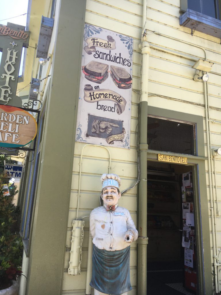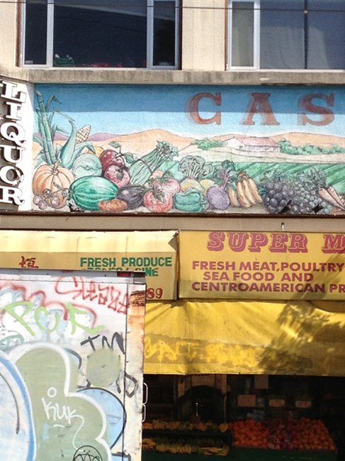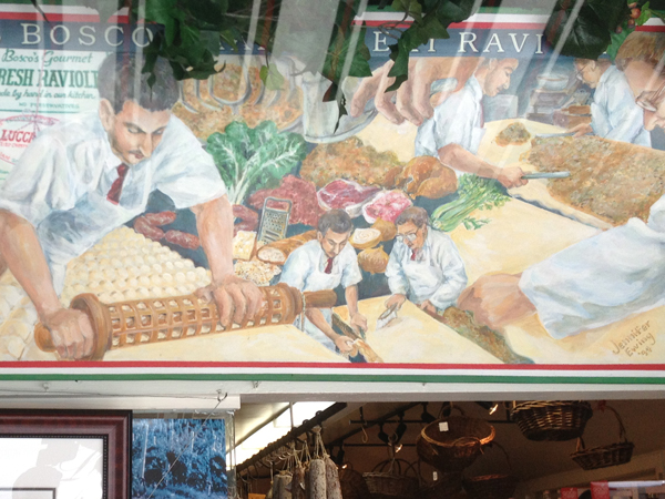
Whatever Chef Pepe’s hand is used for, it has seen a lot of action. But staying on topic (hand-painted food signs), the sandwich is competently rendered, a confident and inviting symmetrical splay. The surface of the toast is very credible. The flowing text banners, the corner embellishments and pointing hand instead of arrow all indicate a Victorian, or at least “historical” identity. Though it’s a little hard to concentrate with Chef Pepe standing there.
(photo by J. Eichman)

