 Hot dog taking a nap on an old sofa. They got this sucker behind safety glass.
Tucson, AZ
September 23, 2018 by Leave a Comment
Mt. Vernon, NY
September 22, 2018 by Leave a Comment
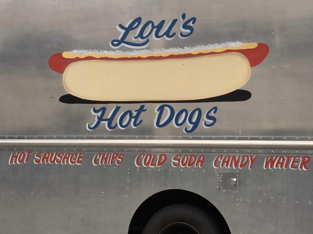
Lou relies pretty heavily on our foreknowledge of sauerkraut. The mustard is not the familiar yellow mustard yellow of the previous post but the symmetrical repose and clean, sharp edges and elegant lettering make it a fun thing to see drive by.
Dodgingtown, Connecticut
May 26, 2014 by Leave a Comment
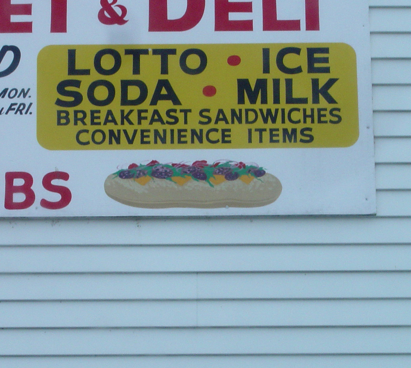
A highly-ordered and self-contained sandwich. Plays well with others, keeps respectful distance from typography. Notice there is no shadow, no table, no other food. This is not a real sandwich, with flavor, but an idea of a sandwich. More an ideogram, a graphic symbol, than a sandwich.
Lake Lure, North Carolina
May 27, 2013 by Leave a Comment
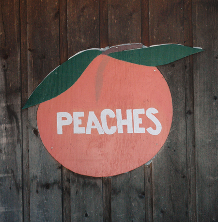
I’ve been stalling on posting “cut-outs” because I find them lackluster and hard to get enthusiastic about them. But enough cut-out food signs have entered the archive that one feels obliged to give them due representation. Dull though they may be. They appear more in rural agricultural areas. At least that is the working theory; let’s see if it bears out. (photo by A. Sebrell)
Twin Rivers, North Carolina
May 27, 2013 by Leave a Comment
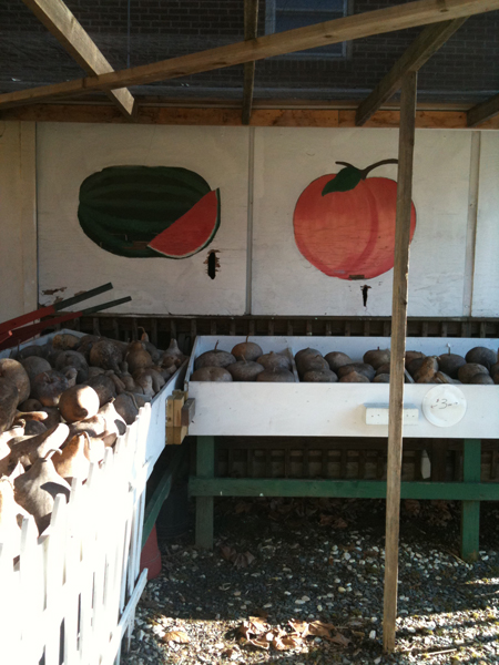
Produce painted at farmer’s markets tend to be among the least adventuresome of food signs. Not surprising, perhaps; it is as if to say: you want a peach, I grow and sell peaches, what more information do you need.
Knoxville, Tennessee
March 26, 2013 by Leave a Comment
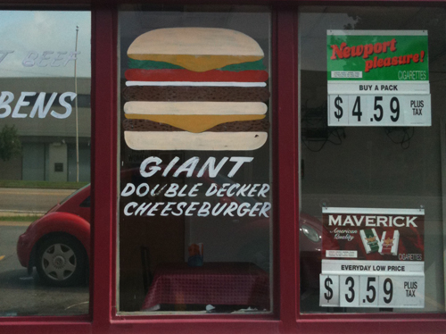
There are a number of signs that might fall into a new category: Frontal. They tend to have a macho and confrontational message. Italics and claims of greatness. Get your smokes and your burgers and sit right here in the window, but don’t expect any special treatment. The stacking here reminds me of the 80’s video game classic “Burgertime.”