Pearl, MS

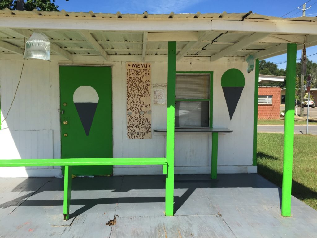
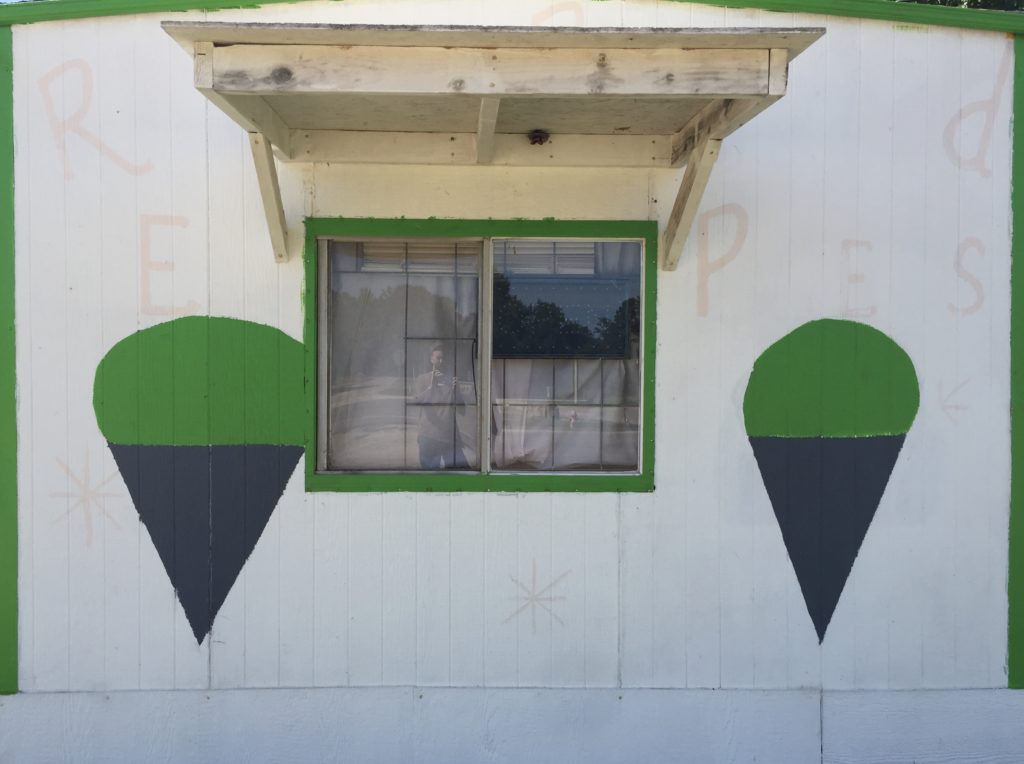
Typically schematic sno-cones. You see them all over the country, always janky, barely thought-through. But I love the simple dark gray and green with super light scattered letters and ubiquitous asterisk elements. Especially endearing is how the one sno-cone has a special bond with the window frame. Auch, and the tight design of the front of the establishment, the play of greens and whites. Pretty classy. Pig lips, please.

Tupelo, MS


“Arsh taters,” you can hear the accent. Irish, or white potatoes, as opposed to sweet potatoes, that’s old school. Pretty low effort, as produce signs tend to be, the shapes forlorn, but touching, especially with the tiny purple car on the window sill. (photo from D. Fortner)

Dodgingtown, Connecticut

dodgingtown, ct1
A highly-ordered and self-contained sandwich. Plays well with others, keeps respectful distance from typography. Notice there is no shadow, no table, no other food. This is not a real sandwich, with flavor, but an idea of a sandwich. More an ideogram, a graphic symbol, than a sandwich.

Chino Valley, Arizona

chino_valley_az_02
At the other end of this very small rural town, yet another cut-out shape sign. This time ice-cream, unnecessarily labeled as such, apparently held against its will other bits of cut-out shapes.  The drip is not convincing, but the cut-out format does not lend itself to realism.

Lake Lure, North Carolina

lakelure, nc_a.sebrell
I’ve been stalling on posting “cut-outs” because I find them lackluster and hard to get enthusiastic about them. But enough cut-out food signs have entered the archive that one feels obliged to give them due representation. Dull though they may be. They appear more in rural agricultural areas. At least that is the working theory; let’s see if it bears out. (photo by A. Sebrell)

Twin Rivers, North Carolina

twinrivers,nc
Produce painted at farmer’s markets tend to be among the least adventuresome of food signs. Not surprising, perhaps; it is as if to say: you want a peach, I grow and sell peaches, what more information do you need.

Knoxville, Tennessee

knoxville01

There are a number of signs that might fall into a new category: Frontal. They tend to have a macho and confrontational message. Italics and claims of greatness. Get your smokes and your burgers and sit right here in the window, but don’t expect any special treatment. The stacking here reminds me of the 80’s video game classic “Burgertime.”

Tucson, Arizona

OLYMPUS DIGITAL CAMERA

Harsh and stiff lines, using a straight edge for everything but the splash.  Decidedly uncelebratory in feeling.

(1st Ave.)


Beacon, New York

This is only interesting in the context of it being part of a pair of schematic ice creams.  In my opinion, schematic food signs are generally not very interesting. I don’t feel anything about ice cream looking at this.  Or its twin.  I think, yeah, I know what ice cream looks like, why are you wasting my time.

beacon,ny02