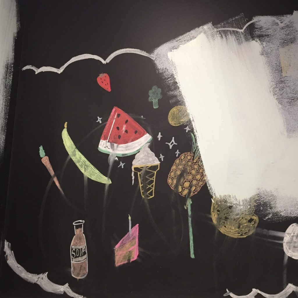
Zero-gravity space picnic at a diner in Tucson. A single example of a wide range of foods, some sharpened, some severely angular, all edging away from an approaching wall of whiteness. (Photo by H. Ensor)
The Hand-Painted Food Signs Archive
Food paintings from all over
Zero-gravity space picnic at a diner in Tucson. A single example of a wide range of foods, some sharpened, some severely angular, all edging away from an approaching wall of whiteness. (Photo by H. Ensor)
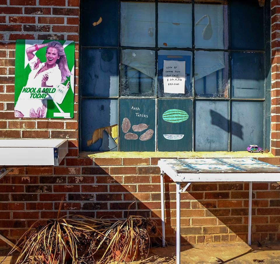
“Arsh taters,” you can hear the accent. Irish, or white potatoes, as opposed to sweet potatoes, that’s old school. Pretty low effort, as produce signs tend to be, the shapes forlorn, but touching, especially with the tiny purple car on the window sill. (photo from D. Fortner)
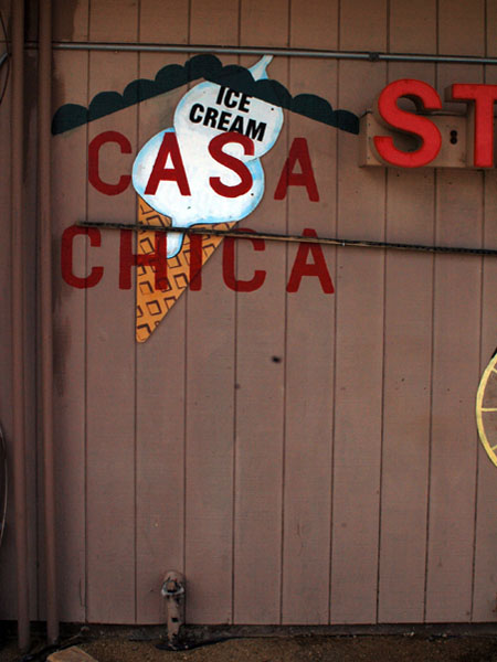
At the other end of this very small rural town, yet another cut-out shape sign. This time ice-cream, unnecessarily labeled as such, apparently held against its will other bits of cut-out shapes. The drip is not convincing, but the cut-out format does not lend itself to realism.
I’ve been stalling on posting “cut-outs” because I find them lackluster and hard to get enthusiastic about them. But enough cut-out food signs have entered the archive that one feels obliged to give them due representation. Dull though they may be. They appear more in rural agricultural areas. At least that is the working theory; let’s see if it bears out. (photo by A. Sebrell)
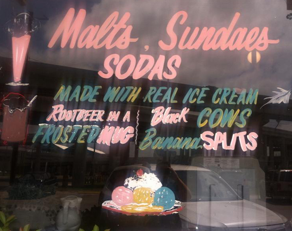
My favorite part of this is all the wonderful text, italicized, some whimsical details. The ice cream image (competently rendered) takes a back seat here. And there’s the fugitive leaf. (photo by L. Davenport)
This definitely goes in the “splashy” category, though slow-motion lava lamp style splashiness. (photo by J. Friedman)
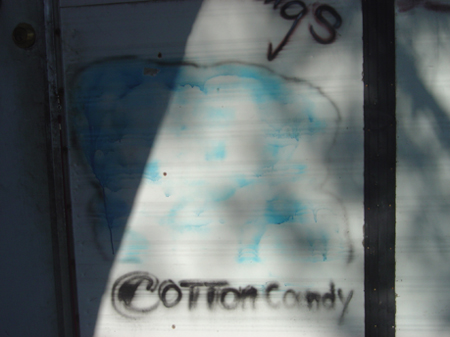
Same food truck as the “chips” painting below. It is true that I’ve never painted cotton candy before, I assume it’s tricky. I’ll leave it at that.
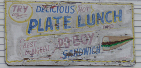
That sandwich reaches the vanishing point. I was giving a presentation about the Hand-Painted Food Signs Archive recently and my neighbor from across the street came to the talk. He has a collection of photographs of signs using superlatives. This one would work for both collections.
(Chartres Ave.)
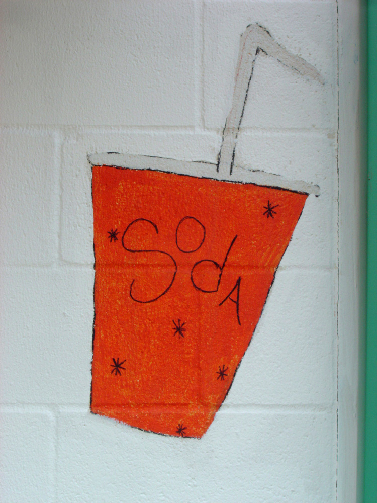
Well, there are those asterisks again. Why is that a go-to embellishment all over the country? Where do we learn that?
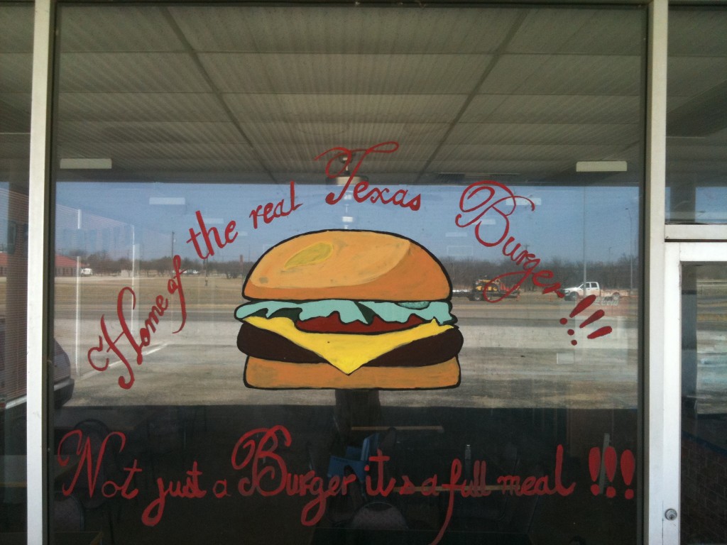
A lot of bravado for a rather bland and risk-averse painting of a cheeseburger. And you’re missing an apostrophe.

“Can I get some hot oysters please? What do you mean you don’t have them they’re painted right there… oh sorry, I didn’t read the text. Can I get some chips please?”

The strokes that make up the crustacea are well-practiced; the turn of each shrimp back is believable, not just a half-moon, but with shrimp-like inflection, and in a single stroke. How did the painter learn that stroke, I wonder? It’s so region-specific. And the same facility is not apparent in the lettering. Not a criticism, just pointing it out.

In the context of the cinderblock concession stand, the text might not be necessary, though an act of generosity nonetheless. The chips read visually as eggs, three-dimensional somehow, even though there is no modeling, maybe because they stand upright instead of stacked. The actual drop of the white wall paint over the nachos means this painting has been preserved. Just making an observation.