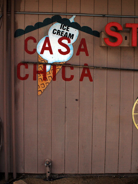
At the other end of this very small rural town, yet another cut-out shape sign. This time ice-cream, unnecessarily labeled as such, apparently held against its will other bits of cut-out shapes. The drip is not convincing, but the cut-out format does not lend itself to realism.
Chino Valley, Arizona
May 27, 2013 by Leave a Comment
San Antonio, Texas
May 27, 2013 by Leave a Comment
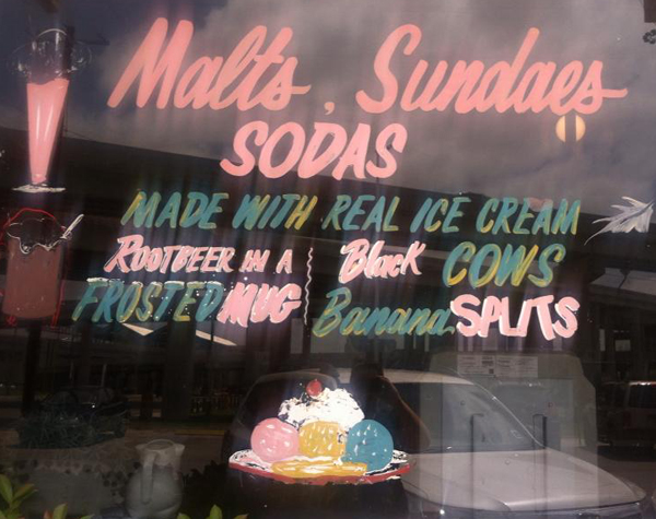
My favorite part of this is all the wonderful text, italicized, some whimsical details. The ice cream image (competently rendered) takes a back seat here. And there’s the fugitive leaf. (photo by L. Davenport)
Chicago, Illinois
January 11, 2013 by Leave a Comment
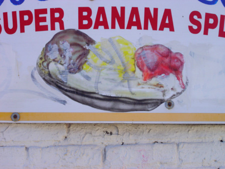
Surprisingly realistic banana split, the drips are working, and as we’ve discussed, they don’t always.
Faben, Texas
January 11, 2013 by Leave a Comment
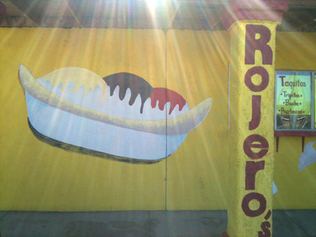
More from the same place, same strange shadow choice. it’s like a shadow, but it doesn’t act like a shadow. Sorry about the glare, the rapture was just starting.
Faben, Texas
January 11, 2013 by Leave a Comment
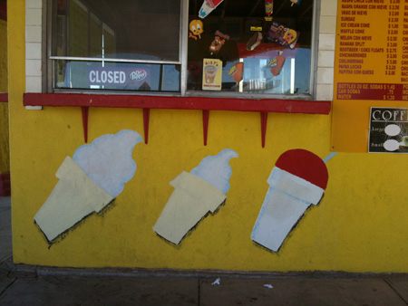
These appear to be cut-outs (which is a whole category of food signs) but they are not. I wonder why the painter decided on that shadow; it represents light acting upon a form, but not the form that’s being represented. Angle, angle, angle. This place was covered in food paintings.
Pittsfield, Massachusetts
October 11, 2012 by Leave a Comment

The chocolate-vanilla swirl presents a formal challenge. So best to set back slightly, stay somewhat hidden. Don’t want to draw too much attention.
Beacon, New York
October 11, 2012 by Leave a Comment
![]()
This is only interesting in the context of it being part of a pair of schematic ice creams. In my opinion, schematic food signs are generally not very interesting. I don’t feel anything about ice cream looking at this. Or its twin. I think, yeah, I know what ice cream looks like, why are you wasting my time.
![]()