Mahopac, New York

OLYMPUS DIGITAL CAMERA

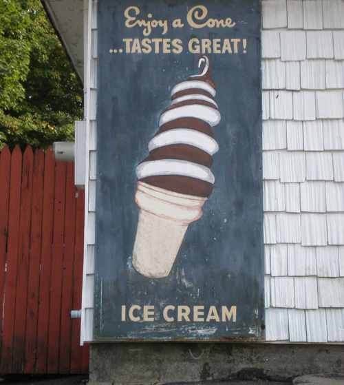
Now that’s a chocolate-vanilla swirl!  Well, actually, they still didn’t quite catch the form… still on the look out for the perfect ice cream swirl cone painting.  What this cone lacks in formal accuracy, it makes up for in confidence, enthusiasm and font choice.

Gary, Indiana

“Can I get some hot oysters please?  What do you mean you don’t have them they’re painted right there… oh sorry, I didn’t read the text.  Can I get some chips please?”


Lebanon, Tennessee

This shape definitely benefits from accompanying text.

Hope, Arkansas

The shyest watermelon in Arkansas.  This and the Pittsfield cone warrant a “Somewhat Hidden” category.  We’ll see if others fall into that category.

Pittsfield, Massachusetts

The chocolate-vanilla swirl presents a formal challenge.  So best to set back slightly, stay somewhat hidden.  Don’t want to draw too much attention.

Kalamazoo, Michigan

The cinderblocks drive me nuts sometimes.  The lettuce is commendable though, lettuce is often crazily represented in food signs (example).   The tangent where the hanging sausage gently meets the ham makes me nervous.

Hattiesburg, Mississippi

The strokes that make up the crustacea are well-practiced; the turn of each shrimp back is believable, not just a half-moon, but with shrimp-like inflection, and in a single stroke.  How did the painter learn that stroke, I wonder?  It’s so region-specific.  And the same facility is not apparent in the lettering.  Not a criticism, just pointing it out.

Calhoun City, Mississippi

On Hwy 9, just north of town.  I pulled over to take a photograph of this sign and as I was getting back in my car, a woman came running out to ask me what the hell I thought I was doing.  I said I was taking a photograph of the food sign.  She said:  “You’re not the guy from the insurance, are you?”  I looked at my old volvo full of art supplies and said “No ma’am, I’m not, I just like paintings.”  She looked at me like she was sure I was lying.

Coahona, Texas

One of the sadder food sign in the Archive.  The sesame seed bun and the red fries container indicate McDonalds.  I don’t think they sell food here.  I think it’s strictly a sun-bleached toy packaging and foresaken strollers kind of operation.

Greeley, Colorado


This is one of the strangest categories in the Archive:  The Incomplete Food Sign.  There are others that I will post.   Why did they stop painting?  Did a war break out?  Did the whole town run out of paint?  It appears everything was fine while all the cupcakes were evenly spaced, but when the pink one made contact with the yellow one, the painter freaked out and couldn’t finish it.

Beacon, New York

This is only interesting in the context of it being part of a pair of schematic ice creams.  In my opinion, schematic food signs are generally not very interesting. I don’t feel anything about ice cream looking at this.  Or its twin.  I think, yeah, I know what ice cream looks like, why are you wasting my time.

beacon,ny02


Ozona, Mississippi

In the context of the cinderblock concession stand, the text might not be necessary, though an act of generosity nonetheless.  The chips read visually as eggs, three-dimensional somehow, even though there is no modeling, maybe because they stand upright instead of stacked.  The actual drop of the white wall paint over the nachos means this painting has been preserved.  Just making an observation.

Baldwin, Georgia

This is one of the first photos I took back in 2004 for what would eventually become this Hand-Painted Food Signs Archive.  It is/was painted on a billboard on Interstate 985 near the Chattahoochee National Forest in North Georgia. An admirable shadow under the food block. The five-tined fork was thrust into that chunk of food cube and next will be forcefully jammed into a wide-open man mouth.

There are hundreds of food signs in this ever-growing Archive.  They have not been posted publicly or properly analyzed, but will be, starting… now.